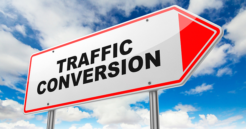
Your goal is to increase conversions without wasting your time, without calling IT, without hiring an expert, and without losing your sanity. Even though CRO is a big, complicated industry, these simple tactics are proven, reliable, effective, and powerful. Take a day or two, implement one or more of these tips, and see what happens. I think you’ll be impressed.
1. Get the most powerful testing software available.
Don’t flinch at dropping a few hundred bucks on some quality software. Fear not. The money you spend will come back. The type of software you need is A/B testing software. Ideally, you want something that you can operate without having to call IT, and without having to attend power user summit conferences. Here are some of the best split testing software options:
- Optimizely
- Visual Website Optimizer
- Unbounce
- Kissmetrics (disclosure: I’m the founder of this company)
- Google Experiments
Some of the above software solutions, such as Google Experiments, are free.
2. A/B test non-stop.
The biggest conversion gains come through split testing. Split testing or A/B testing is the process of using two versions of a website or landing page. You give version A to a set of visitors, and version B to another set of visitors. Then, you compare the two, to see which version gave you the most conversions. Split testing is the most reliable way to find out which version converts better. Once you have your testing software in place, start by performing a series of tests on your pages. Since a quality test takes a while to run, you should always be testing something. Here are some valuable tests to start with:
- The headline text
- The call to action text
- The number of fields in a form
- The placement of the call to action
- The size of the image
- The size or style of font
- The color schem
3. Place your CTA above the fold.
To make it easier for visitors to convert, try putting your call to action (CTA) where people can see it right away — above the fold. This refers to the portion of your home page that is visible when you land on it, without scrolling. Don’t eliminate any CTAs below the fold, though. If you have a substantial amount of content on the page, then users may want to read it. Once they finish scrolling to the bottom, they will be ready to convert. Put a CTA there, too. It’s okay to have multiple CTAs on a page, as long as the CTA has the same action and purpose.
4. Shorten your form.
Website users are turned off by having to fill out long forms. Make your forms as short as possible. If your goal is to get email addresses, then don’t ask for the user’s first name, last name, phone number, and size of company. Those details are irrelevant to your goal of getting an email address. Focus on the goal, and get rid of any fields that distract from that goal.
5. Make your call to action bigger.
The bigger the CTA, the better the conversion rates. Many companies have simply made their call to action button a bit bigger, and watched their conversion rates grow by 10 percent to 25 percent. That’s significant. According to Fitt’s law, the bigger and closer your CTA button, the easier and more likely people are to click on it.
6. Make your headline more obvious.
More than 80 percent of your site visitors will read your headline, which is the large font text that typically appears at the top of your web page. If you want to draw in more visitors with your headline, You can improve it in three ways:
- Make it bigger. A bigger headline will attract more eyeballs.
- Make it shorter. If your headline is longer than 20 words, you’ll start to lose some people. A headline is meant to have instant impact.
- Make it easy to understand. A headline isn’t the place to be cute or clever. Blunt, plain, straightforward language is best. Make it clear enough for a four-year old to understand it.
7. Add testimonials.
Most users are not going to automatically trust your website. You have to create trust. The best way to create trust is with testimonials. Testimonials show users what other happy customer have to say about you. Here are features of effective testimonials:
- Show pictures of the actual person. No stock photos.
- Feature the name of the person and two or three details about them, such as their position, company, location, etc. These are real people with real lives.
- Use testimonials of people that are in your target audience. Your testimonials don’t have to come from famous people. A compelling testimonial comes from someone who is just like a potential customer.


